In my last post I used data from the New York Times Github repository. The authors update it within a day or two but I found a new crowdsourced data source from the local tech community that is typically updated within minutes of the Department of Health data posting.
Data Loading
The Google Sheet is very nice to look at but I’ve had issues recently with loading data directly from Google sheets. Fortunately the community also made available the data via a heroku app that allows CSV file download.
Packages
library(dplyr)##
## Attaching package: 'dplyr'## The following objects are masked from 'package:stats':
##
## filter, lag## The following objects are masked from 'package:base':
##
## intersect, setdiff, setequal, unionlibrary(ggplot2)
library(lubridate)##
## Attaching package: 'lubridate'## The following object is masked from 'package:base':
##
## datelibrary(scales)
library(tidyr)
library(zoo)##
## Attaching package: 'zoo'## The following objects are masked from 'package:base':
##
## as.Date, as.Date.numericData Download
covid <- readr::read_csv('https://covid19-hawaii.herokuapp.com/hawaii_daily.sqlite/hawaii_daily?_format=csv&_size=max')## Parsed with column specification:
## cols(
## .default = col_double(),
## Date = col_character(),
## `Total Tests` = col_number(),
## `Daily Tests` = col_number(),
## `Total Private Tests` = col_number(),
## `Negative Tests` = col_number(),
## `OHCA Licensed Beds` = col_number(),
## `Non-ICU Beds` = col_number(),
## Source = col_character(),
## `Unnamed: 40` = col_character()
## )## See spec(...) for full column specifications.timestamp() # Data pull time## ##------ Tue Apr 14 19:16:19 2020 ------##Data processing steps.
covid$Date <- mdy(covid$Date)Change per Day
Here’s the change in our state per day, smoothed with the loess method (regression line fitting).
covid %>% filter(!is.na(`New Cases`)) %>%
  ggplot(aes(x = Date, y = `New Cases`)) +
  geom_point() +
  geom_line() +
  geom_smooth() +
  labs(title ="New Coronavirus Positive Tests, Hawaii",
       subtitle = "With loess smoothing line") +
  ylab("Positive Tests")
## `geom_smooth()` using method = 'loess' and formula 'y ~ x'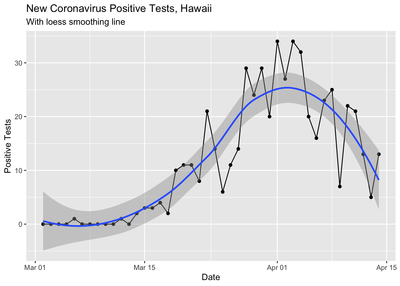
I also tried smoothing by drawing a 7 day running average. I used a (new to me) function from the zoo time series analysis package.
covid %>% select(Date, `New Cases`) %>%
  mutate(rolling_mean_7d = rollmean(`New Cases`, 7, align = 'right', fill = NA)) %>%
  mutate(newcases = `New Cases`) %>%
  select(Date, newcases, rolling_mean_7d) %>%
  gather(`rolling_mean_7d`, `newcases`, key = seriesname, value = cases) %>%
  ggplot(aes(x = Date, y = cases, color = seriesname)) +
  geom_point() +
  geom_line() +
  labs(title ="New Coronavirus Positive Tests, Hawaii",
       subtitle = "With 7 Day Rolling Mean") +
  ylab("Positive Tests")
## Warning: Removed 8 rows containing missing values (geom_point).## Warning: Removed 8 row(s) containing missing values (geom_path).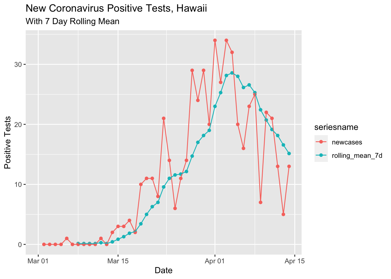
Discussion
Both the loess smoothed and rolling 7 day mean curves are pretty nice, showing a reduction in the new positive tests per day in the last 2 weeks. There is speculation that the 5 positive tests on April 13 was due to slow test reporting from the Easter weekend. Today (4/14) had more than twice the previous day. In any case, I would guess the overall trend is downards now and I hope it continues!