It’s been a couple of weeks since I reran the graphs with new data. Since then there have been thankfully few cases of coronavirus in our state. It’s clearly still circulating at some small level but once we get to this type of number, it becomes possible to track down and isolate the contacts.
library(dplyr)##
## Attaching package: 'dplyr'## The following objects are masked from 'package:stats':
##
## filter, lag## The following objects are masked from 'package:base':
##
## intersect, setdiff, setequal, unionlibrary(ggplot2)
library(lubridate)##
## Attaching package: 'lubridate'## The following objects are masked from 'package:dplyr':
##
## intersect, setdiff, union## The following objects are masked from 'package:base':
##
## date, intersect, setdiff, unionlibrary(scales)
library(tidyr)
library(zoo)##
## Attaching package: 'zoo'## The following objects are masked from 'package:base':
##
## as.Date, as.Date.numericcovid <- readr::read_csv('https://covid19-hawaii.herokuapp.com/hawaii_daily.sqlite/hawaii_daily?_format=csv&_size=max')## Parsed with column specification:
## cols(
## .default = col_double(),
## Date = col_character(),
## `Total Tests` = col_number(),
## `Daily Tests` = col_number(),
## `Total Private Tests` = col_number(),
## `Negative Tests` = col_number(),
## `OHCA Licensed Beds` = col_number(),
## `Non-ICU Beds` = col_number(),
## `Occupied Beds` = col_number(),
## Source = col_character(),
## `Unnamed: 40` = col_character(),
## `Unnamed: 41` = col_logical(),
## `Unnamed: 42` = col_logical(),
## `Unnamed: 43` = col_logical(),
## `Unnamed: 44` = col_logical(),
## `Unnamed: 45` = col_logical(),
## `Unnamed: 46` = col_logical(),
## `Unnamed: 47` = col_logical(),
## `Unnamed: 48` = col_logical(),
## `Unnamed: 49` = col_logical(),
## `Unnamed: 50` = col_logical()
## # ... with 5 more columns
## )## See spec(...) for full column specifications.timestamp() # Data pull time## ##------ Sun May 10 15:01:01 2020 ------##covid$Date <- mdy(covid$Date)
covid %>% select(Date, test_total = `Total Tests`, test_daily = `Daily Tests`,
test_total_neg = `Negative Tests`, test_total_pos = `Positive Tests`,
test_total_inconcl = `Inconcl Tests`) %>%
mutate(daily_positive = test_total_pos - lag(test_total_pos),
daily_negative = test_total_neg - lag(test_total_neg),
daily_inconcl = test_total_inconcl - lag(test_total_inconcl)) %>%
select(Date, test_daily, daily_positive, daily_negative, daily_inconcl)## # A tibble: 70 x 5
## Date test_daily daily_positive daily_negative daily_inconcl
## <date> <dbl> <dbl> <dbl> <dbl>
## 1 2020-03-01 NA NA NA NA
## 2 2020-03-02 NA NA NA NA
## 3 2020-03-03 NA NA NA NA
## 4 2020-03-04 NA NA NA NA
## 5 2020-03-05 NA NA NA NA
## 6 2020-03-06 NA NA NA NA
## 7 2020-03-07 NA NA NA NA
## 8 2020-03-08 NA NA NA NA
## 9 2020-03-09 NA NA NA NA
## 10 2020-03-10 NA NA NA NA
## # … with 60 more rowsHere I updated all the other coronavirus curves for 5/10/2020.
covid %>% filter(!is.na(`New Cases`)) %>%
  ggplot(aes(x = Date, y = `New Cases`)) +
  geom_point() +
  geom_line() +
  geom_smooth(se = F) +
  labs(title ="New Coronavirus Positive Tests, Hawaii",
       subtitle = "With loess smoothing line") +
  ylab("Positive Tests")
## `geom_smooth()` using method = 'loess' and formula 'y ~ x'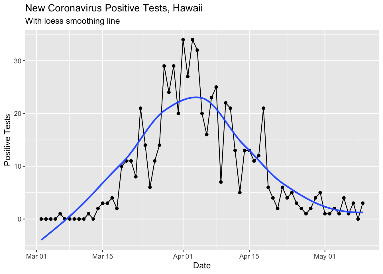
This loess smoothed curve is a little silly now that the cases are so low since the smoothing makes the curve dip below 0.
I updated the rolling mean curve to look a little nicer and show the difference between the day’s count and the rolling mean with different shapes.
covid %>% select(Date, `New Cases`) %>%
  mutate(rolling_mean_7d = rollmean(`New Cases`, 7, align = 'right', fill = NA)) %>%
  mutate(newcases = `New Cases`) %>%
  select(Date, newcases, rolling_mean_7d) %>%
  ggplot(aes(x = Date)) +
  geom_bar(aes(y = newcases), stat = 'identity', fill = 'darkolivegreen3') +
  geom_line(aes(y = rolling_mean_7d), color = 'red') +
  labs(title ="New Coronavirus Positive Tests, Hawaii",
       subtitle = "With 7 Day Rolling Mean") +
  ylab("Positive Tests")
## Warning: Removed 1 rows containing missing values (position_stack).## Warning: Removed 7 row(s) containing missing values (geom_path).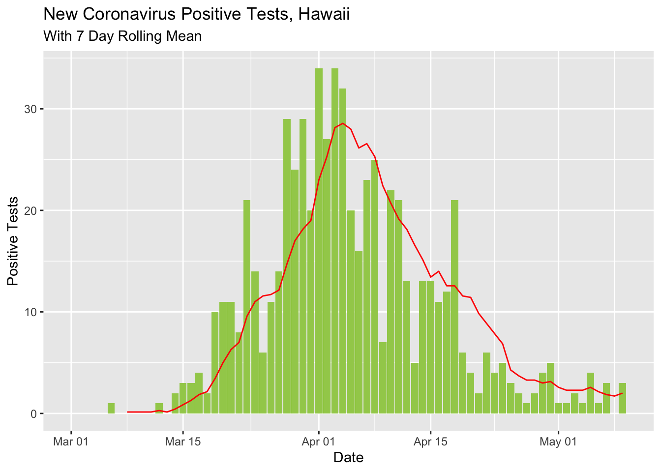
covid %>%
  select(Date, total_cases = `Total Cases`, total_released = `Total Released`) %>%
  mutate(active_cases = total_cases - total_released) %>%
#  gather(total_cases, total_released, key = "case_type", value = "cases") %>%
  ggplot(aes(x = Date, y = active_cases)) +
  geom_point() +
  geom_line() +
  ylim(0, 400) + xlim(ymd('2020-03-24'), ymd('2020-04-30')) +
  ggtitle("Active Cases of Coronavirus, Hawaii")
## Warning: Removed 35 rows containing missing values (geom_point).## Warning: Removed 35 row(s) containing missing values (geom_path).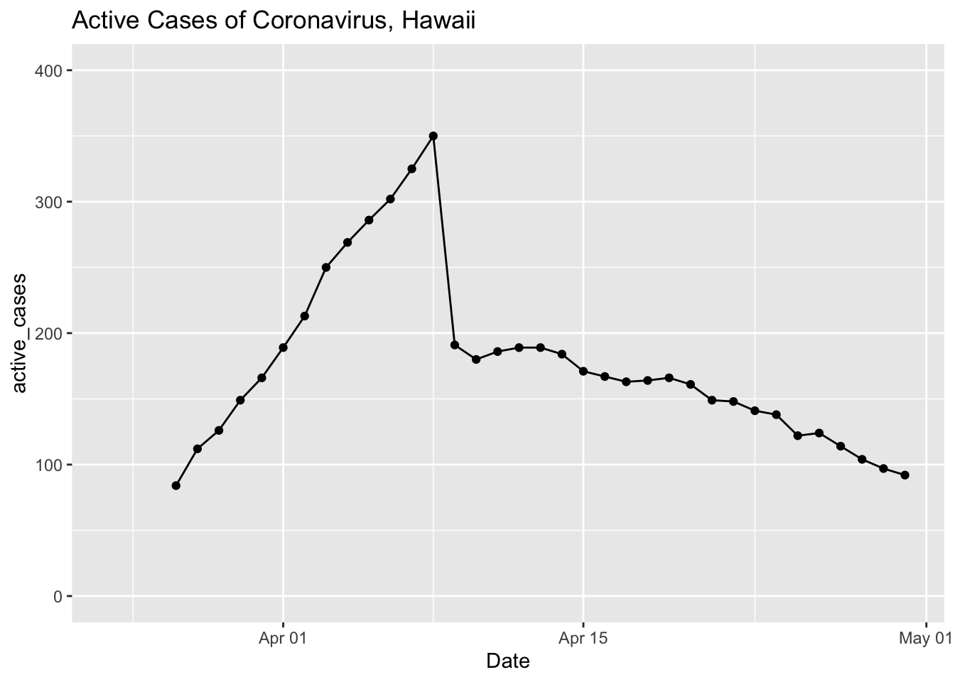
License
These data are subject to the following license:
Data license: Creative Commons Attribution 4.0 International · Data source: Community Maintained Daily Hawaii COVID-19 Metrics · About: This is a community maintained, unofficial table of COVID-19 stats compiled from DOH and media reports. Accuracy is not guaranteed. Please see the Data source link to report any errors.