Since the DOH does not publish data on how Hawaii fares compares to the CDC school reopening criteria, and since Maui is getting out of control, I figured I would update my graphs from last week. See that post for more context on where these numbers come from.
I again downloaded the data from the “How is Hawaii Doing at Flattening the Epidemic Curve?” Tableau figure on the Hawaii DOH COVID-19 data site. It has daily counts by county and the positive and total tests.
library(tidyverse)## ── Attaching packages ────────────────────────────── tidyverse 1.3.0 ──## ✓ ggplot2 3.3.2 ✓ purrr 0.3.4
## ✓ tibble 3.0.3 ✓ dplyr 1.0.2
## ✓ tidyr 1.1.2 ✓ stringr 1.4.0
## ✓ readr 1.3.1 ✓ forcats 0.5.0## ── Conflicts ───────────────────────────────── tidyverse_conflicts() ──
## x dplyr::filter() masks stats::filter()
## x dplyr::lag() masks stats::lag()library(lubridate)##
## Attaching package: 'lubridate'## The following objects are masked from 'package:base':
##
## date, intersect, setdiff, union# Read in data
dat <- read_csv("../datasets/DOH_COVID20210227.csv")## Parsed with column specification:
## cols(
## County = col_character(),
## Date = col_character(),
## NewCases = col_double(),
## NewPositiveTests = col_double(),
## TotalTestEncounters = col_double()
## )dat## # A tibble: 1,806 x 5
## County Date NewCases NewPositiveTests TotalTestEncounters
## <chr> <chr> <dbl> <dbl> <dbl>
## 1 Hawaii 2/15/20 0 0 0
## 2 Hawaii 2/28/20 0 0 0
## 3 Hawaii 3/2/20 0 0 0
## 4 Hawaii 3/3/20 0 0 1
## 5 Hawaii 3/6/20 0 0 0
## 6 Hawaii 3/7/20 0 0 0
## 7 Hawaii 3/8/20 0 0 0
## 8 Hawaii 3/9/20 0 0 0
## 9 Hawaii 3/10/20 0 0 0
## 10 Hawaii 3/11/20 0 0 0
## # … with 1,796 more rows# Make variables into right classes
dat$County <- factor(dat$County)
dat$Date <- mdy(dat$Date)
# County population data from 2019 US Census
county_pops <- data.frame(County = c("Hawaii", "Honolulu", "Kauai", "Maui", "Missing"),
pops = c(201513, 974563, 72293, 167417, NA))
# Make case count graph
dat %>% left_join(county_pops, by = "County") %>%
group_by(County) %>%
arrange(Date) %>%
mutate(total_cases = cumsum(NewCases)) %>%
mutate(cases_7d_ago = lag(total_cases, 7, default = 0)) %>%
mutate(cases_7d_sum_per100k = (total_cases-cases_7d_ago)/pops*100000) %>%
filter(Date > "2020-12-31") %>%
ggplot(aes(x = Date, y = cases_7d_sum_per100k, color = County)) +
geom_line() +
labs(title = "Total Cases Per 100,000 in Last 7 Days",
subtitle = "CDC Indicators to Inform Decision Making") +
ylab("Total cases over last 7 days per 100,000 population") +
geom_hline(yintercept = 9.5, linetype = "dotted", color = "blue") +
geom_hline(yintercept = 49.5, linetype = "dotted", color = "yellow") +
geom_hline(yintercept = 99.5, linetype = "dotted", color = "orange")## Warning: Removed 56 row(s) containing missing values (geom_path).
# Make Test Positive Graph
dat %>%
  group_by(County) %>%
  arrange(Date) %>%
  mutate(total_tests = cumsum(TotalTestEncounters)) %>%
  mutate(total_positives = cumsum(NewPositiveTests)) %>%
  mutate(total_tests_7d_ago = lag(total_tests, 7, default = 0)) %>%
  mutate(total_positives_7d_ago = lag(total_positives, 7, default = 0)) %>%
  mutate(test_positive_rate_7d = (total_positives-total_positives_7d_ago) /
           (total_tests - total_tests_7d_ago)) %>%
  select(County, Date, test_positive_rate_7d) %>%
  filter(Date > "2020-12-31") %>%
  ggplot(aes(x = Date, y = test_positive_rate_7d*100, color = County)) +
  geom_line() +
  labs(title = "Test Positive Rate in Last 7 Days",
       subtitle = "CDC Indicators to Inform Decision Making") +
  ylab("Test positive rate over last 7 days (%) ") +
  geom_hline(yintercept = 5, linetype = "dotted", color = "blue") +
  geom_hline(yintercept = 7.95, linetype = "dotted", color = "yellow") +
  geom_hline(yintercept = 9.95, linetype = "dotted", color = "orange")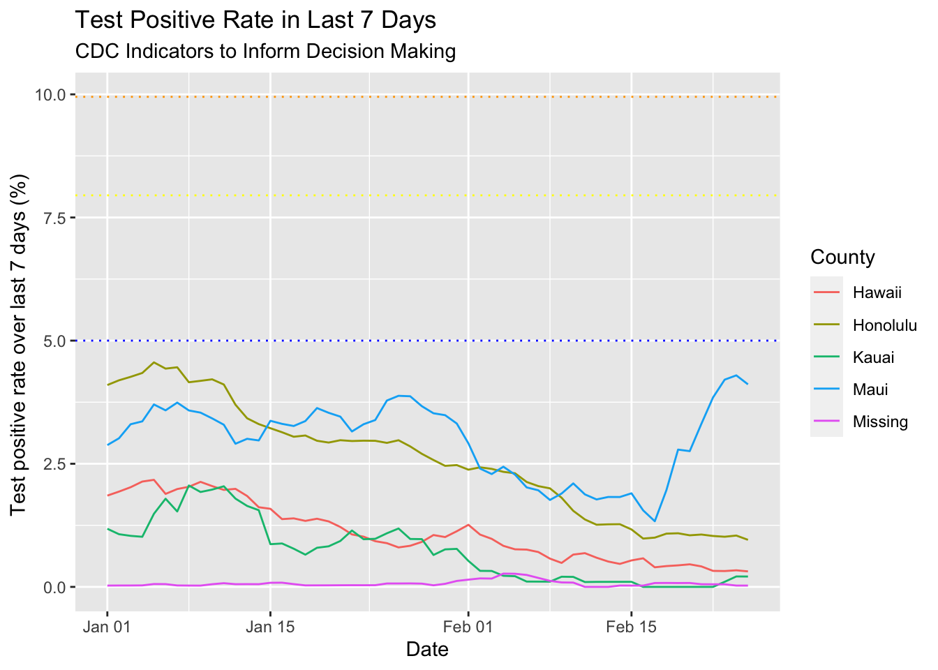
Oops, as I was writing this I discovered I had written a helper function to help with the calculations…
rollsum <- function(x, lag_start, lag_end) {
  require(dplyr)
  total = 0
  for(i in lag_start:lag_end) {
    total <- total + lag(x, i, default = 0)
  }
  return(total)
}
Time to rewrite the code for those plots using the new function! It saves some lines of code but also seems to make it more readable to me.
# Make case count graph
dat %>% left_join(county_pops, by = "County") %>%
  group_by(County) %>%
  arrange(Date) %>%
  mutate(cases_7d_sum_per100k = rollsum(NewCases, 0, 6)/pops*100000) %>%
  filter(Date > "2020-12-31") %>%
  ggplot(aes(x = Date, y = cases_7d_sum_per100k, color = County)) +
  geom_line() +
  labs(title = "Total Cases Per 100,000 in Last 7 Days",
       subtitle = "CDC Indicators to Inform Decision Making") +
  ylab("Total cases over last 7 days per 100,000 population") +
  geom_hline(yintercept = 9.5, linetype = "dotted", color = "blue") +
  geom_hline(yintercept = 49.5, linetype = "dotted", color = "yellow") +
  geom_hline(yintercept = 99.5, linetype = "dotted", color = "orange")
## Warning: Removed 56 row(s) containing missing values (geom_path).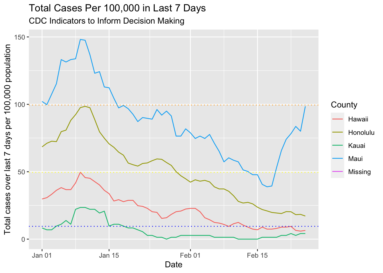
# Make Test Positive Graph
dat %>%
  group_by(County) %>%
  arrange(Date) %>%
  mutate(test_positive_rate_7d = rollsum(NewPositiveTests, 0, 6) /
           rollsum(TotalTestEncounters, 0, 6)) %>%
  select(County, Date, test_positive_rate_7d) %>%
  filter(Date > "2020-12-31") %>%
  ggplot(aes(x = Date, y = test_positive_rate_7d*100, color = County)) +
  geom_line() +
  labs(title = "Test Positive Rate in Last 7 Days",
       subtitle = "CDC Indicators to Inform Decision Making") +
  ylab("Test positive rate over last 7 days (%) ") +
  geom_hline(yintercept = 5, linetype = "dotted", color = "blue") +
  geom_hline(yintercept = 7.95, linetype = "dotted", color = "yellow") +
  geom_hline(yintercept = 9.95, linetype = "dotted", color = "orange")